Why spider charts bugs me
spider charts
Published on September 18, 2015
Don’t use radar/spider chart to display your data. Seriously. They are the comic sans of charting. In this article, Graham Odds give some of the reasons.
Beside the terrible readability of the graph, in my opinion the biggest problems with radar charts are two:
- linking values that are unrelated,
- suggesting that the surface area of the shape is significant.
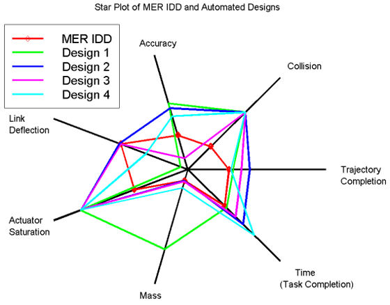
Comparing apples to oranges
The various axis of the graph can have different units and labels. That is fine. But we link them with a line, like in the graph above! Why? How can you link two values with different units? A line suggests a comparison which cannot be done. Furthermore changing the scale on one axis will completely change the way the graph is looking.
The bigger the better
The line connecting the axis is eventually coming back to its first point, enclosing a shape. We naturally think that this shape is significant, and that its surface area matters: the bigger, the better. But that is wrong: by rearranging the axis order, you can completely change the surface of the shape.
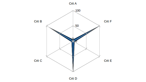
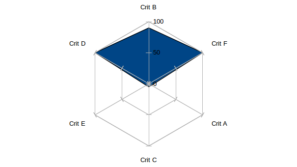
Look at these two radar charts. The first one looks definitely skinnier than the second one. They are telling two completely different stories! However, if you look closer, they use the same data. Only the order of the axis is rearranged.
Circular data
The only case where a radar chart can be justified is when the data have some circularity.
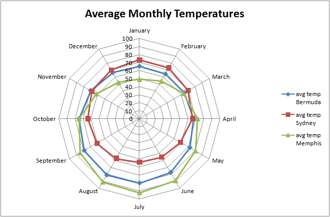
In this example, it’s natural to represent the data in a circular shape, because it’s intrinsically cyclic. The month of Decembre is definitely connected to the month of January. This effect couldn’t be obtained with a bar chart, for example.